Modern Fertility
Brand Identity | Social Awareness | Experience Design
Fertility isn’t static. It evolves, expands, and—when supported—blooms. My goal was to visually represent that journey with a design system that felt human, hopeful, and grounded in science.
Project overview
Modern Fertility is a self-initiated passion project developed to explore how design can improve the way fertility is communicated. The goal was to create a brand system that is thoughtful, informative, and approachable.
The Challenge
- Communicate complex medical information in a way that is visually approachable
- Build a cohesive identity that works across both clinical and lifestyle spaces
- Develop a multi-platform system that feels unified across app, social, print, and real-world environments
Outcome
- Spark national conversation and press coverage around fertility awareness
- Create long-term brand recall through iconic visual identity
Process
My approach began with research into how fertility is currently discussed and visualized, primarily through clinical, sterile design systems. I wanted to counter that with something warmer and more symbolic.
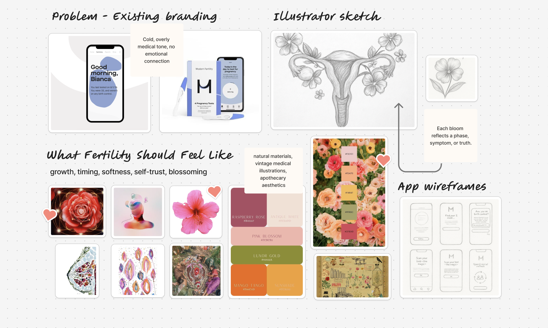
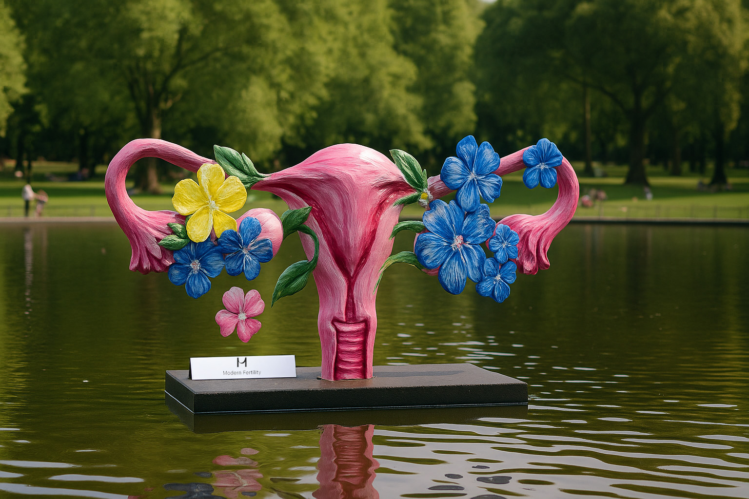
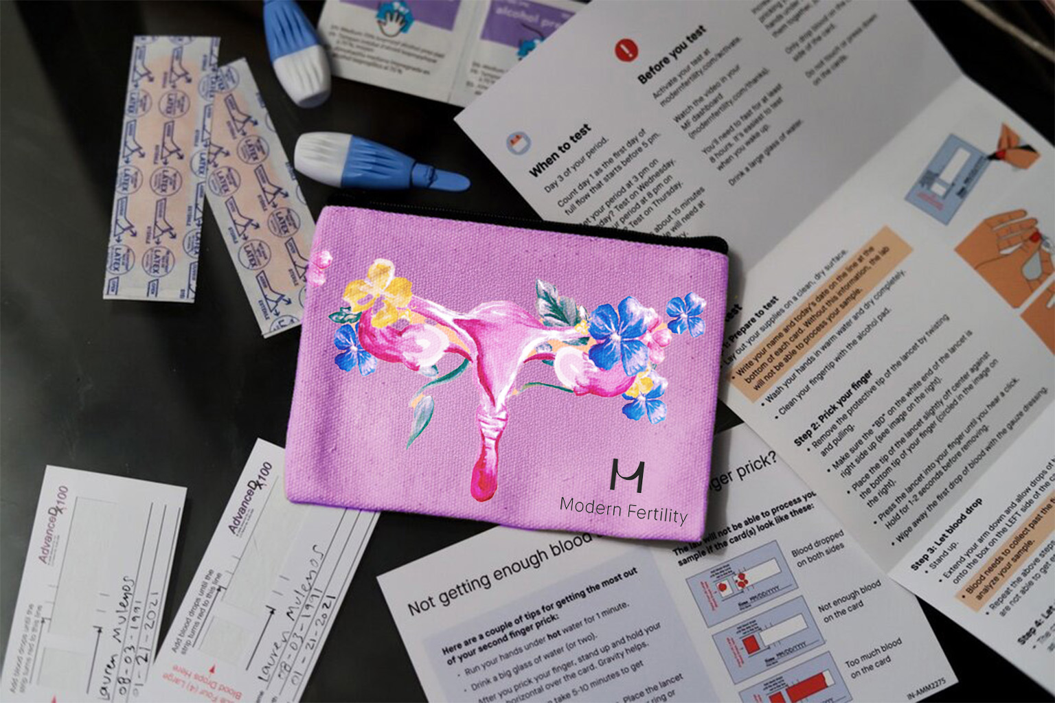
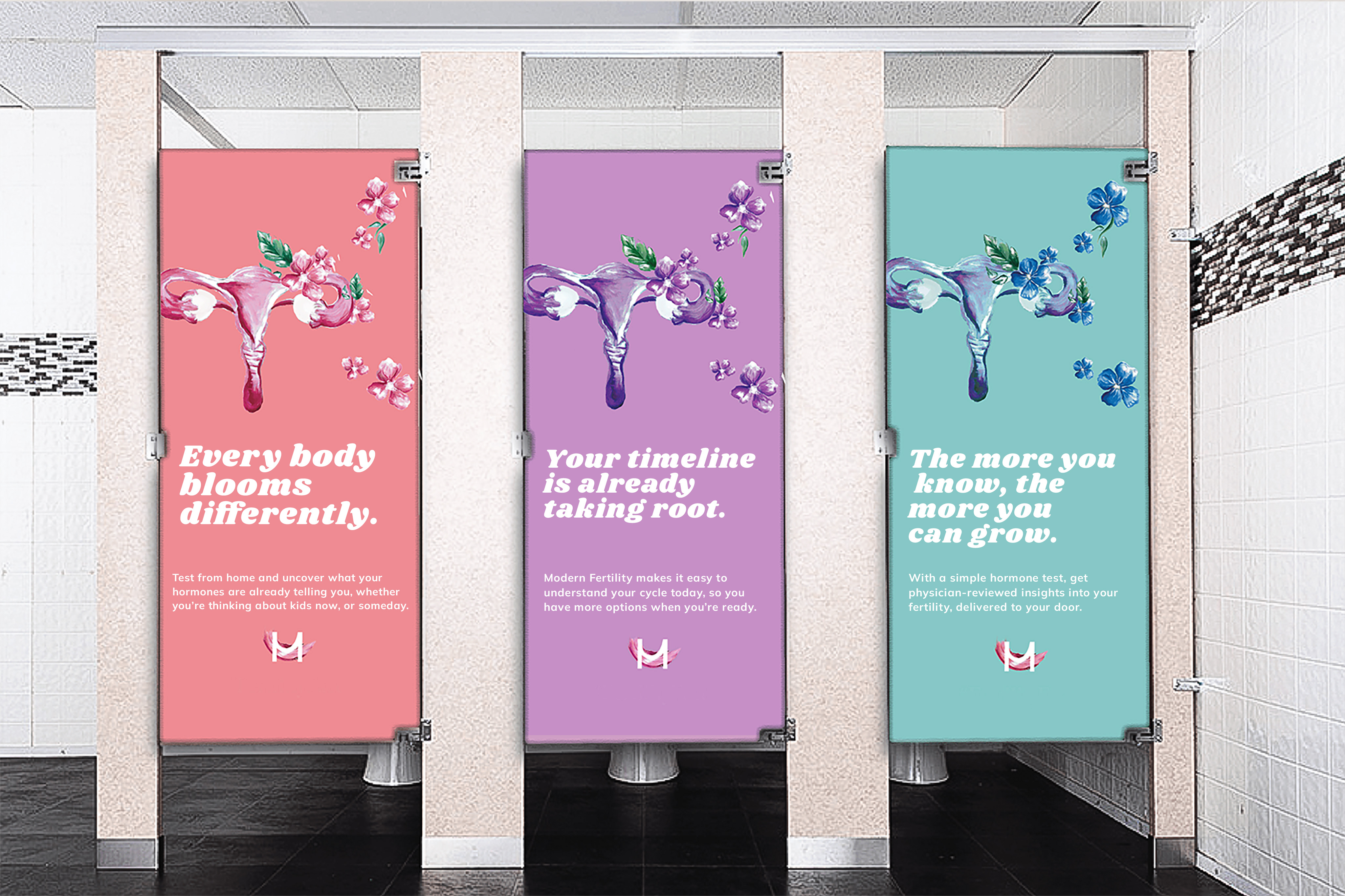
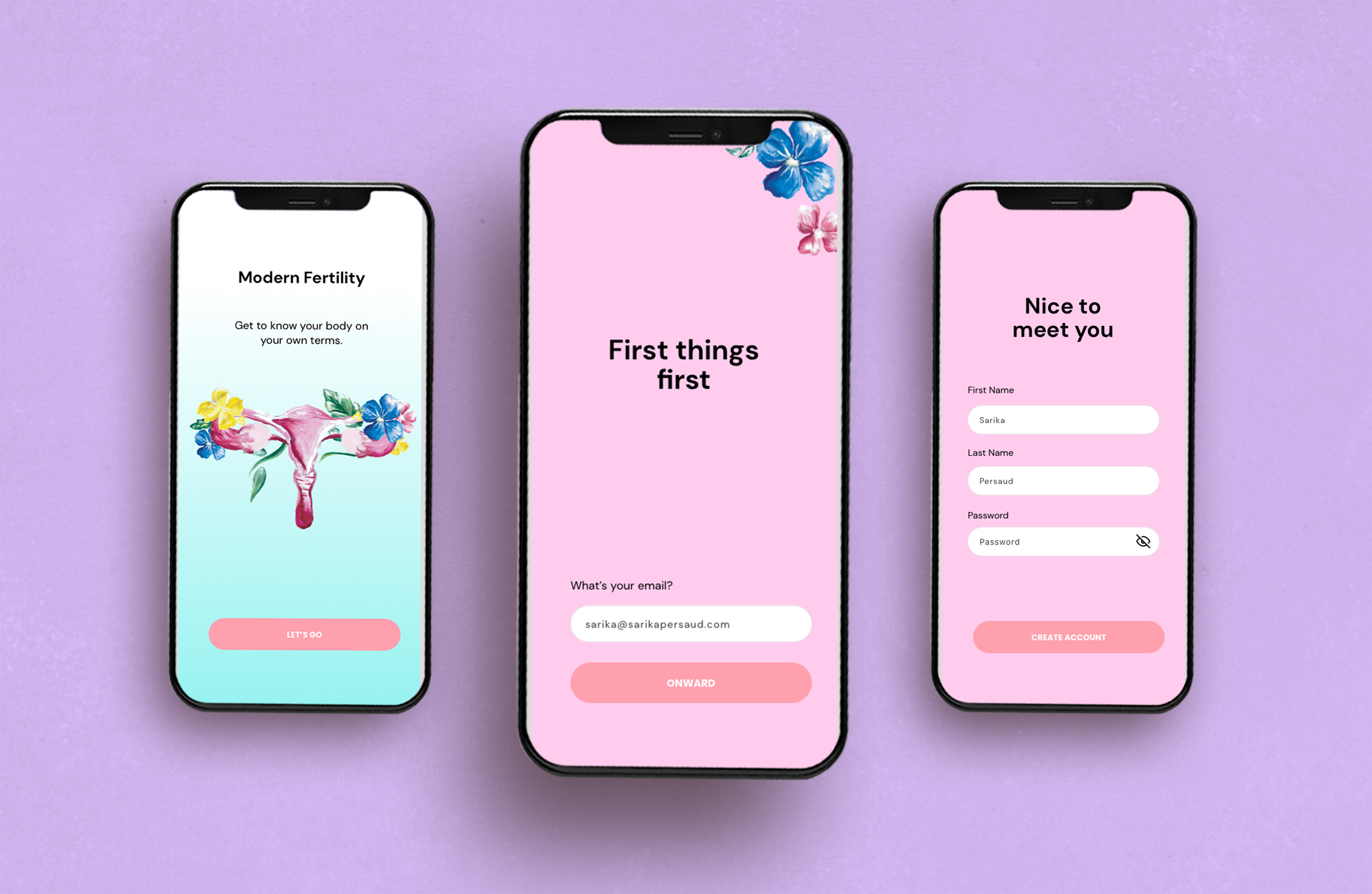
Floral Uterus Illustration
A hand-painted uterus made of blooming flowers. Each bloom represents a different story, symptom, or phase in the fertility experience. This became the signature of the brand system, used across app screens, packaging, posters, and merchandise.

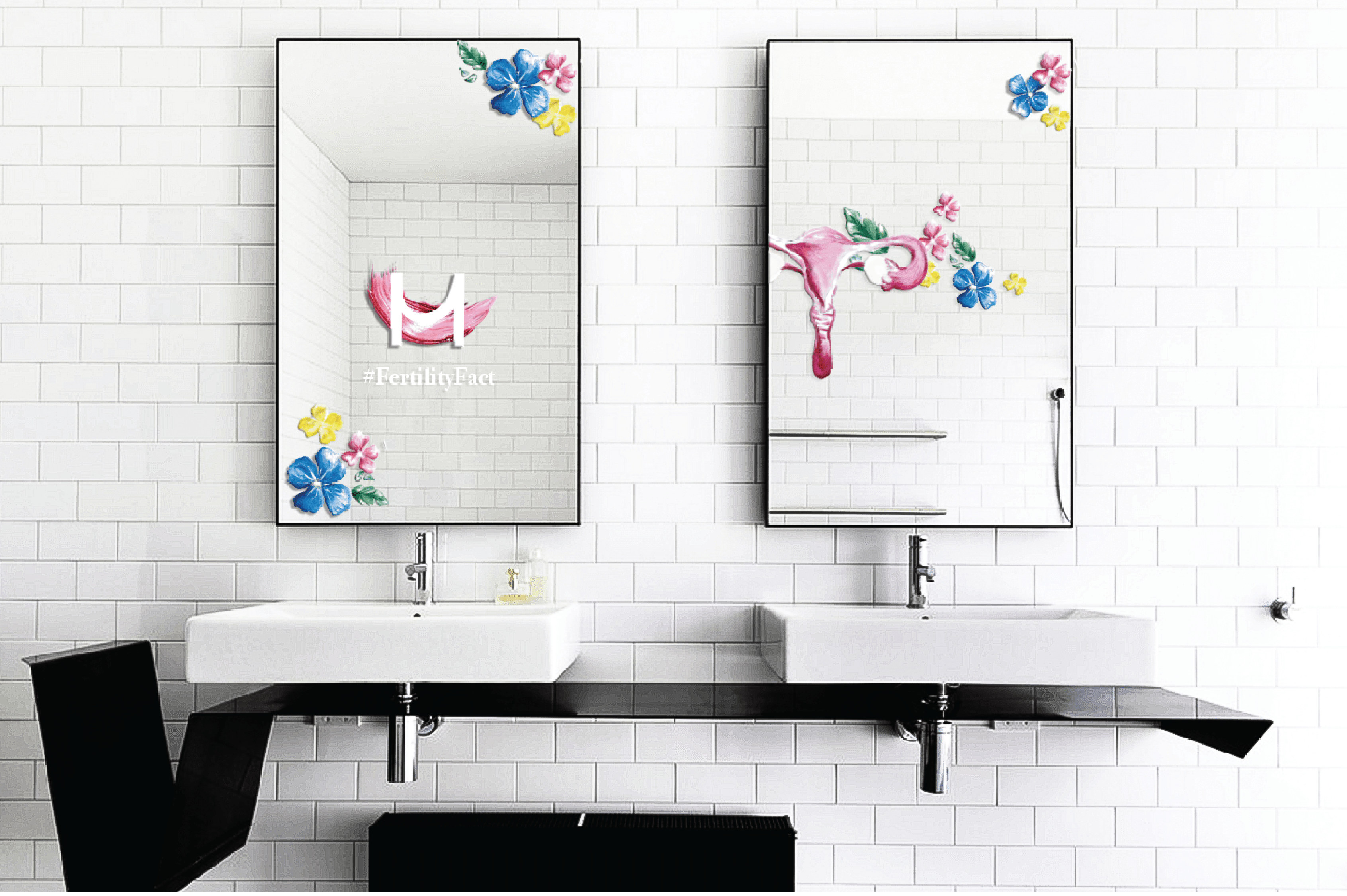
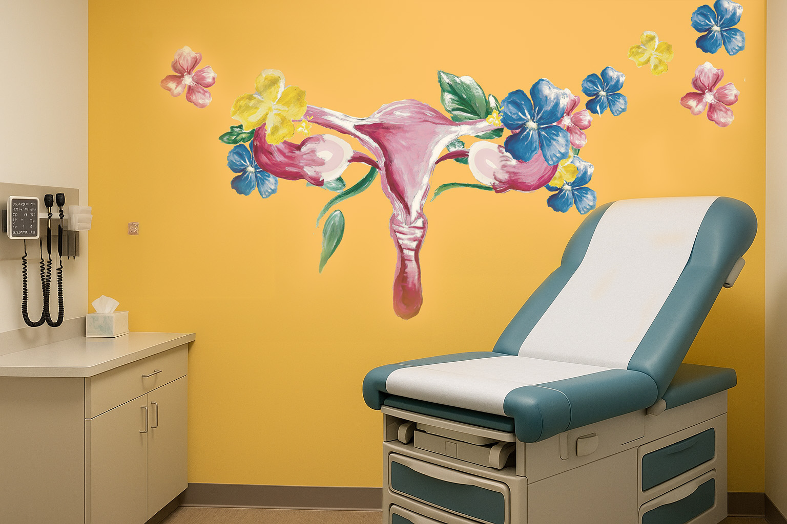
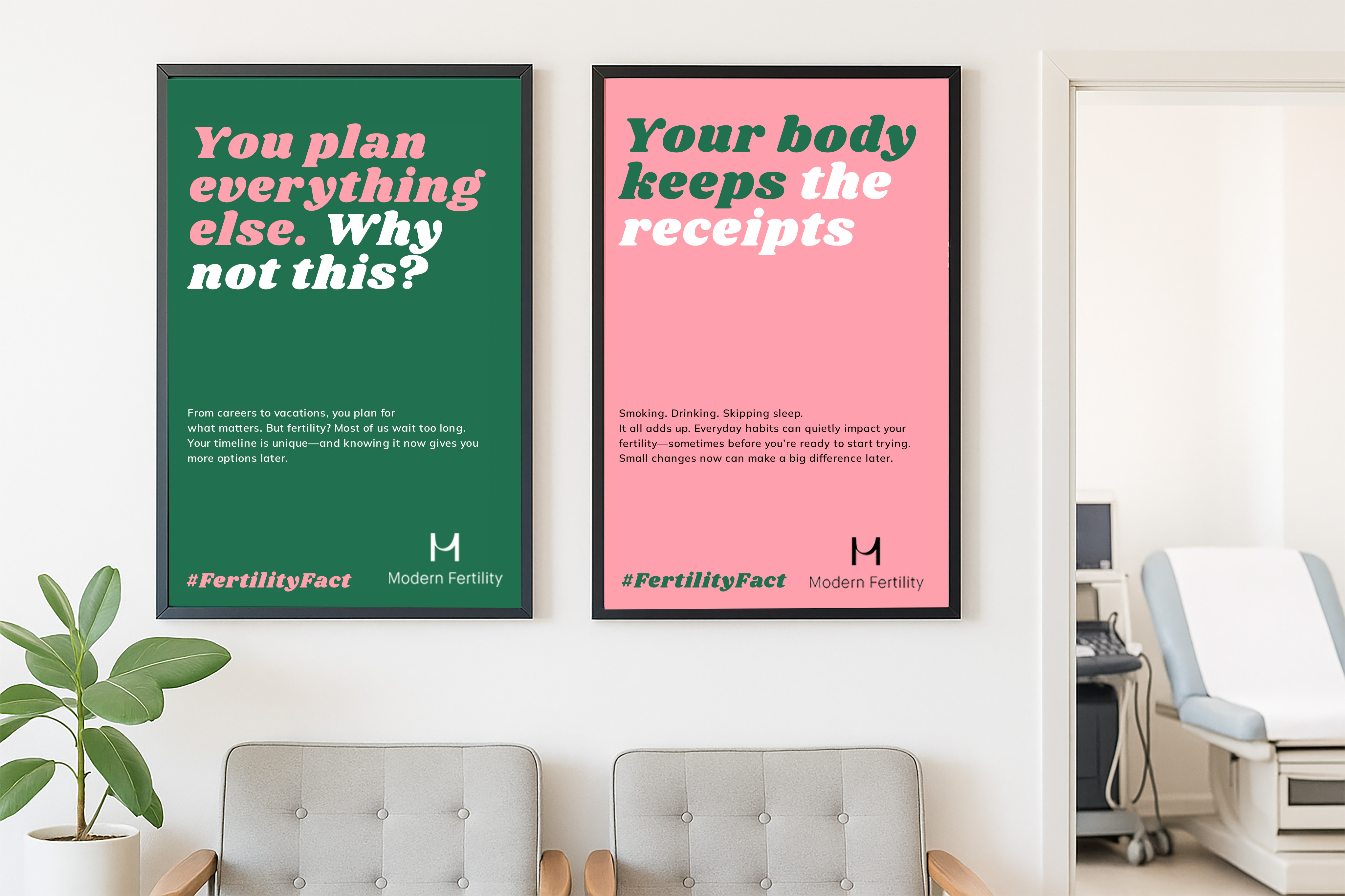
OOH & Environmental Design
Designed waiting room posters and restroom graphics that use fertility facts to prompt quiet reflection in overlooked spaces. The tone is educational, not alarmist. The visuals balance strength with softness.
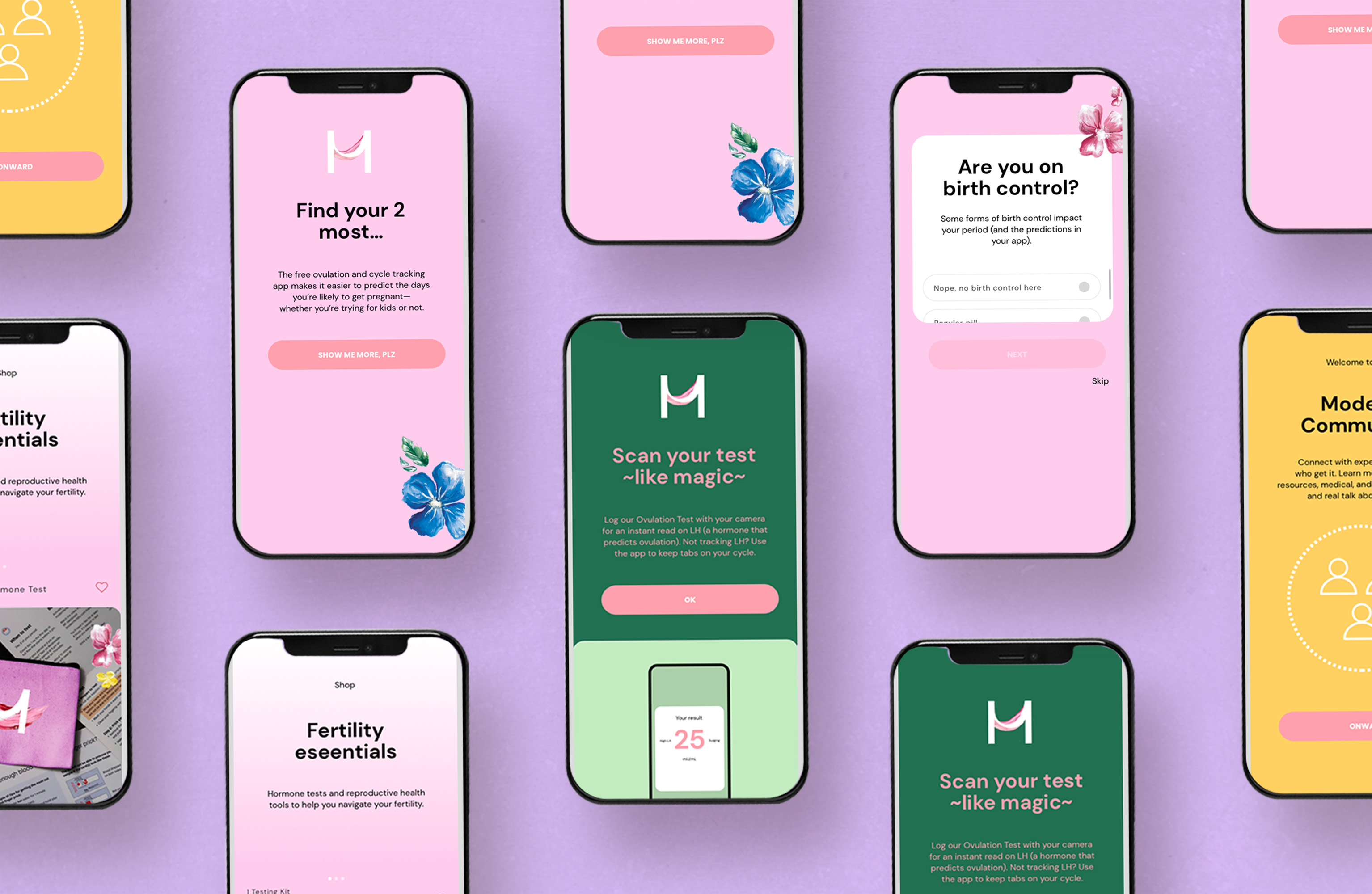
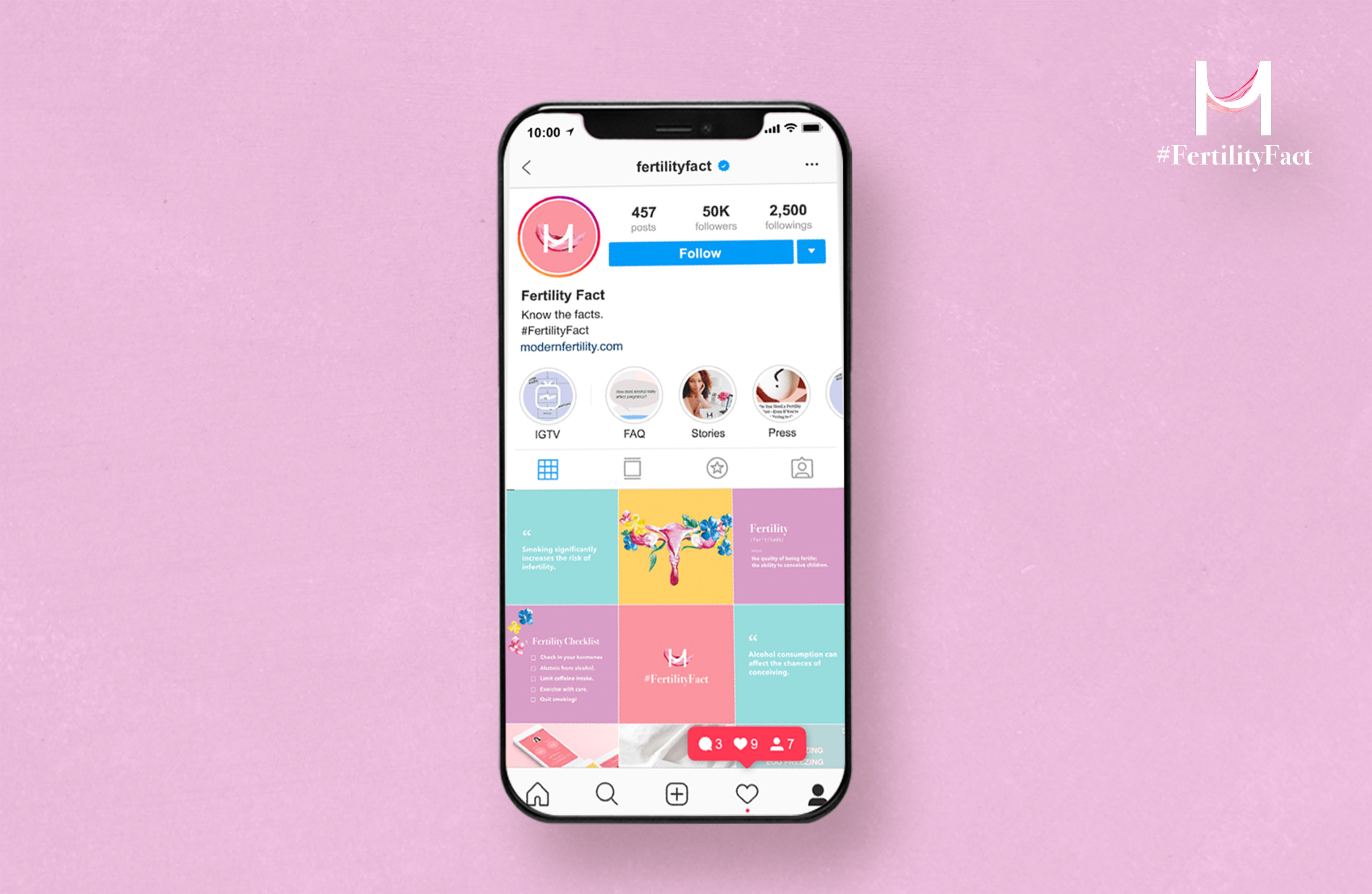
App & Social Refresh
The mobile app was redesigned with floral accents, a softened color palette, and improved flow logic. I also developed a unified Instagram presence, supporting the #FertilityFact campaign through grid templates and story assets.
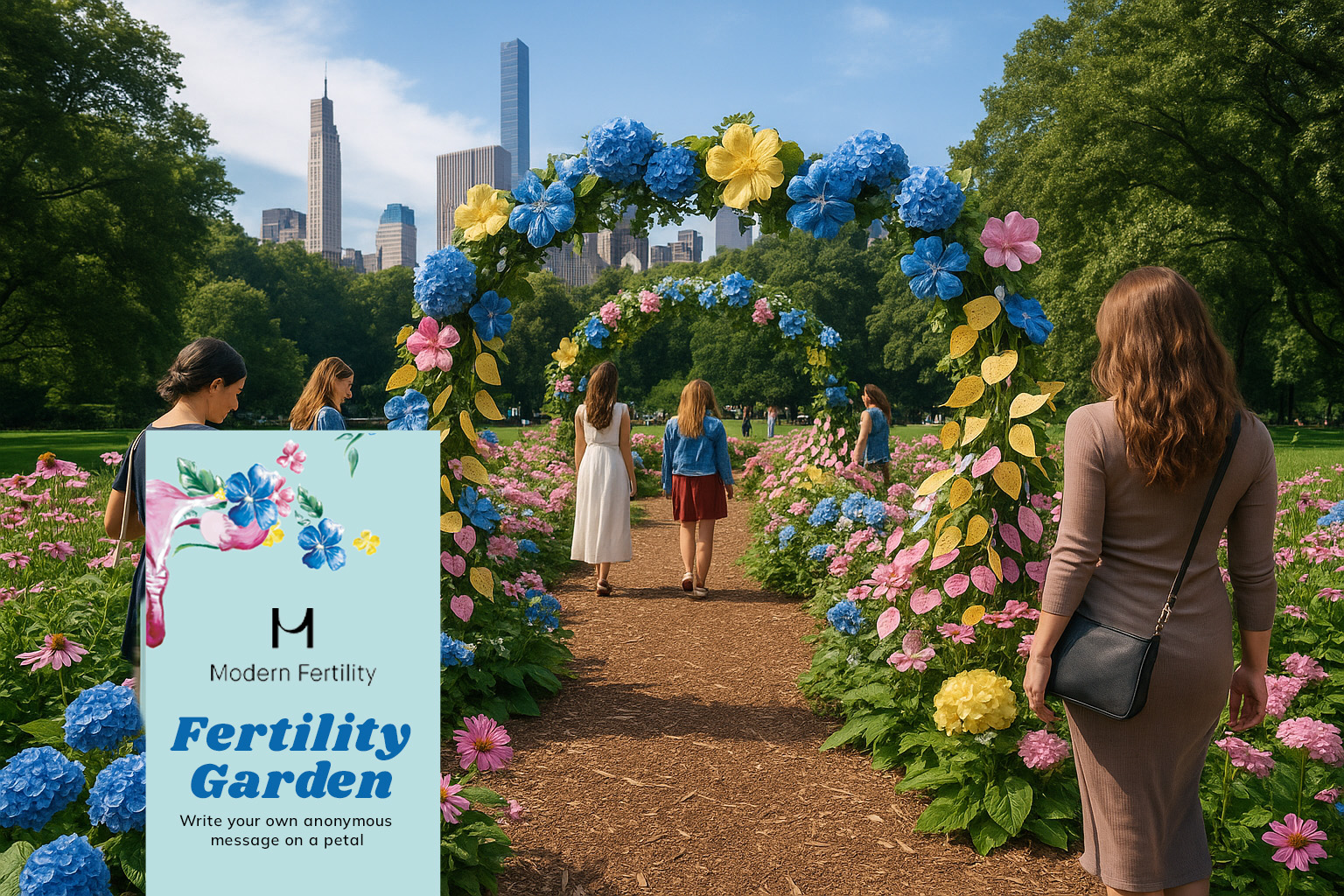
The Fertility Garden
A public installation concept designed for parks in New York City, Los Angeles, and Chicago. Each flower contains a fertility fact or real story, while guests are invited to write their messages on petals and plant them along the pathway—the goal: quiet education through physical interaction.
"Uterus in the Wild" Ambient Series
A set of large-scale floral uterus sculptures designed to appear in unexpected urban places—on rooftops, near commuter stations, and floating in public parks. Each includes a scannable call to action and QR-based fact delivery.